
Getting started with Power BI is a lot easier than most people expect. You do not need to be a data analyst or a spreadsheet wizard to build useful reports. If you can work with an Excel file, you can start building interactive dashboards in Power BI.
The basic flow is simple: install Power BI Desktop, bring in your data, clean it up if needed, connect related tables, and then turn everything into visuals that respond in real time.
Install Power BI Desktop
If you are using a Windows PC, the easiest way to install Power BI Desktop is through the Microsoft Store. Open the Store from the Start menu or search for it in Windows, then search for Power BI.
You will likely see more than one result. The one you want is Power BI Desktop. That is the app used to build reports and dashboards. If it is your first time installing it, the button will say Get. If it is already installed, it may say Open or Update.

Power BI Desktop is free to use with a Microsoft account, and it gives you everything you need to start building reports from scratch, creating charts, and organizing business data in a way that actually makes sense.
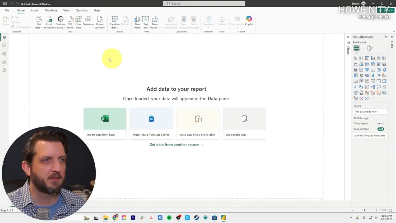
Start with a blank report
Once Power BI opens, you will land on the home screen. From there, you can start with a blank report or connect to a common data source right away, such as Excel or SQL Server.
For a beginner, starting with a blank report is usually the cleanest path because it helps you understand where everything lives. After selecting that option, Power BI opens the report view, which is the main workspace where you build visuals and layout your dashboard.
Import Excel data into Power BI
Excel is one of the most common starting points, so that is the example used here. From the report view, choose the option to import data from Excel. That opens File Explorer, where you can locate your workbook.
After selecting the file, Power BI opens the Navigator window. This is where it shows all the sheets and tables inside the workbook. If your file has several tabs, you can choose one or several at the same time.
Once you select the table or sheet you want, click Load. Power BI imports the data and adds it to the fields area on the right side of the screen.
If you are trying to speed up the process of turning raw data into polished dashboards and presentations, the free data visualization prompt pack mentioned in the video can be useful as a workflow shortcut.
Understand the fields pane
After the data loads, you will see your imported table in the fields pane. Expand it and you will find each column listed underneath.
These fields are the building blocks for your report. You can click them to add them to the canvas, or drag them into visuals later. If you add a table visual, for example, each selected field becomes a visible column in that table.
This is also where you start trimming things down. If a column is not useful, such as an internal item number or SKU, you can simply remove it from the visual. That way your report stays focused on the information that matters.
Clean and transform data before building visuals
Not every data source comes in perfectly organized. Sometimes columns are messy, blank rows are hanging around, or you only want part of the dataset. That is where Transform Data comes in.
Open the transform option and Power BI launches the Power Query editor. This is where you can shape the data before using it in a report.
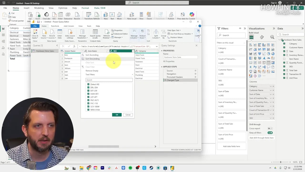
Inside Power Query, you can do things like:
- Remove columns you do not need
- Filter out blank values
- Keep only certain text or categories
- Filter number ranges, such as excluding values below a threshold
One important point: these changes do not alter the original Excel file. They only change the version of the data being used inside Power BI.
That makes Power Query a safe place to clean things up without worrying about damaging the source file. Once the cleanup is done, use Close & Apply to push those changes back into your report.
Bring in a second table
Power BI becomes far more useful when you work with more than one dataset. In the example, a second Excel table is imported to bring in additional customer purchase information.
You can load another workbook directly, or open it in Power Query first and clean it before bringing it into the model. Both approaches work. If the data is already in good shape, load it. If not, transform it first.
Once the second table is added, Power BI can begin linking related fields across the datasets.
Use Model view to connect tables
This is where Power BI starts to feel powerful.
Switch over to Model view, and you will see each imported table displayed as a separate box. If Power BI recognizes a shared field, such as a customer name appearing in both tables, it may automatically create a relationship between them.
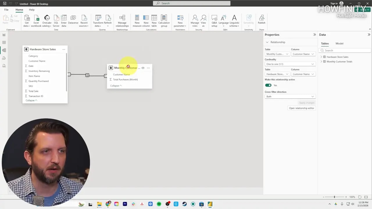
That relationship tells Power BI how the tables fit together. Instead of keeping your data isolated in separate spreadsheets, it creates a connected model that can be used in one report.
If Power BI does not detect the right relationship on its own, you can create one manually. The idea is straightforward:
- Choose the matching field from the first table
- Choose the related field from the second table
- Save the relationship
This matters because your charts and calculations depend on these links. Without them, your report may not combine the data correctly. With them, Power BI can pull together information from multiple sources into one readable dashboard.
Build your first visual
Once the tables are connected, go back to Report view. You now have access to fields from both datasets in the same report.
To create a chart, select a visual type from the visualization area. In the walkthrough, a bar chart is used to display total customer purchases.
The setup is simple:
- Place the customer name on the X axis
- Place the total purchases field on the Y axis
As soon as those fields are assigned, Power BI draws the chart for you.
From there, you can resize the visual, move it around the canvas, and fine tune how it looks.
Create summary cards for key numbers
Charts are great for comparisons, but sometimes you just want a single number front and center. That is where a card visual comes in.
One easy way to create a new visual is to click a blank part of the report canvas and then choose a field from the fields pane. Power BI may insert it using the last chart type you used, but you can switch it instantly by choosing a different visual format.
In the example, a field for total sales is added and then converted into a card. Instead of a bar chart, it becomes one large summary number.
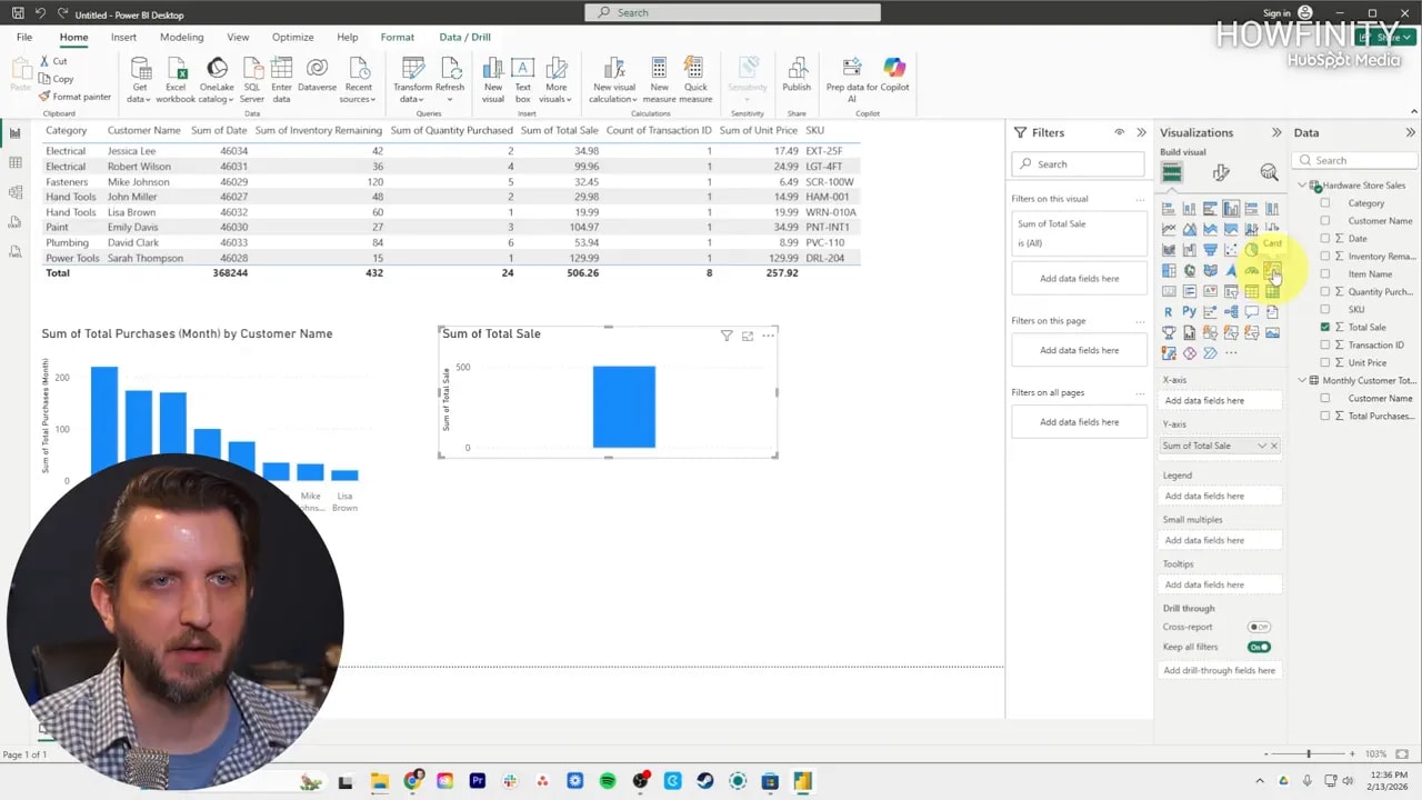
This is a great way to surface high level KPIs, totals, or performance numbers that need to stand out.
Make the report interactive
One of the best parts of Power BI is that the visuals are not static. They respond to one another.
If you click a single bar in the customer purchases chart, Power BI filters the rest of the report to match that selection. So instead of only seeing the overall total, the card can update to reflect the selected customer.
Click a different bar and the numbers adjust again. Clear the selection and the full totals return.
That interactivity is what separates a dashboard from a screenshot of a spreadsheet. It lets you explore the data instead of just staring at it.
Share the report
Once the report is built, Power BI makes sharing straightforward. Use the Share option to create a link for others, or send access directly to specific email addresses.
That lets multiple people work from the same report and interact with the same set of numbers, filters, and visuals.
Instead of passing around different spreadsheet versions, everyone can stay aligned around one dashboard.
A simple beginner workflow to remember
If you are brand new to Power BI, keep this sequence in mind:
- Install Power BI Desktop
- Start a blank report
- Import your Excel data
- Clean it in Power Query if needed
- Add more tables if necessary
- Create relationships in Model view
- Build charts and cards in Report view
- Use interactivity to explore the data
- Share the final report
That is the core foundation. Once you are comfortable with that workflow, the rest of Power BI starts to feel much more approachable.
FAQ
Is Power BI Desktop free?
Yes. Power BI Desktop is free to install and use with a Microsoft account for building reports and dashboards.
Can I use Excel files in Power BI?
Yes. Excel is one of the easiest and most common ways to get started. You can import sheets or tables from a workbook directly into Power BI.
What does Transform Data do in Power BI?
It opens Power Query, where you can clean, filter, and reshape your data before using it in a report. These changes affect the Power BI dataset, not the original spreadsheet.
Why are relationships between tables important?
Relationships allow Power BI to connect data from different tables. Without them, your visuals may not combine information correctly across datasets.
What is the easiest first chart to build in Power BI?
A bar chart is a strong first choice. Add a category field such as customer name to one axis and a number field such as total purchases to the other.
Can Power BI reports be interactive?
Yes. Selecting an item in one visual can filter and update the others in real time, which makes dashboards much more useful for analysis.
How do I share a Power BI report?
You can share it by generating a link or granting access to specific email addresses so others can open and interact with the report.